Your SEO optimized title
darth-vader
Enlarge

TOAST IT LIKE DARTH!

Posted on January 6, 2015 by Editorial Staff

A striking addiction to any kitchen! Molded in sturdy black plastic and meticulously detailed, it’s obviously the Darth Vader Toaster! Two pieces of bread and Vader ejects them with his portrait into one side and the “Star Wars” logo into the other. 

Beakfast is going to a darker side! 

www.hammacher.com


1
Enlarge

CUT THE RIBBON: MARTHA GRAHAM

Posted on January 5, 2015 by Editorial Staff

Dance genius Martha Graham studied at the Denishawn School of Dancing and Related Arts before establishing the Martha Graham Centre of Contemporary Dance in 1926. Rejecting classical European ballet, she  searched in primitive societies the inspiration for her spiritual-like naturalistic moves she interpreted bare feet. Her innovative dance had, the most long-lasting influence on contemporary performance. Deeply influenced by the political climate, she could be considered the ‘Picasso of dance’. A woman who made her modern dance popular in a country she so strongly analysed and represented, creating a unique ‘American experience’.As she used to say : ‘nothing is more revealing than a movement.’

MONGO-HARLOW
Enlarge

HOLD IT WITH REGARD, MORGAN LAPPIN

Posted on December 12, 2014 by Editorial Staff

Work: Mongo Drain Mouth- analog collage

www.morganlappin.com

The Big City
Enlarge

HOLD IT WITH REGARD, MORGAN LAPPIN

Posted on December 5, 2014 by Editorial Staff


Oh, talents! A fresh smell of ‘thenextbigthing’ was in the air  when Morgan Jesse Lappin presented his works to The Harlow. Hold On With High Regard will host his work. We suggest you discovering this artist and his webpage. ‘When making collage pieces the images I use come mostly from old encyclopedias, and other older publications. I use nothing more than a physical cut and paste/tape method with all my work. Throughout the years I’ve adopted a few different styles of collage and am always looking for fresh ways to present my work. I spend probably 85% of the time cutting and collecting images and the rest of the time actually making work. I have hundreds of categories with thousands of pre-cut images in folders ready to go. It’ll just take a few more life times to get to it all.’

Morgan Jesse Lappin, collage artist/musician living in Brooklyn. Collage  an OCD passionate since  2007. In December 2013 he put together the Brooklyn Collage Collective, now over 30 members strong.

Work: The Big City – analog collage

www.morganlappin.com

HALSTONINVENTING
Enlarge

INVENTING AMERICAN FASHION, HALSTON

Posted on November 5, 2014 by Editorial Staff

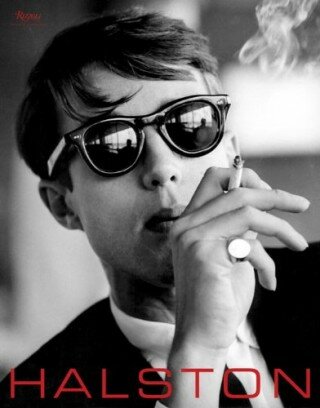
A new book on American Designer Halston is coming out the 14th of November. Written by Leslie Frowick, Halston’s niece and confidante, this book aims to chronicle the designer’s life and his glamorous, minimalist aesthetic. This is the first serious “monograph” on Halston and its two decades of splendor. From the raise in 60ies till the very last days, Leslie Frowick  spotlights her uncle’s  most important design achievements and his collaborations with  Martha Graham, Elsa Peretti, and Hiro. The untold story of Halston that solidifies his place as a key designer in American fashion. Overture words by forever friend Liza Minnelli. From Rizzoli Usa.


COCO CHANEL - FULCO DI VERDURA
Enlarge

THE DUKE OF VERDURA

Posted on November 3, 2014 by Editorial Staff

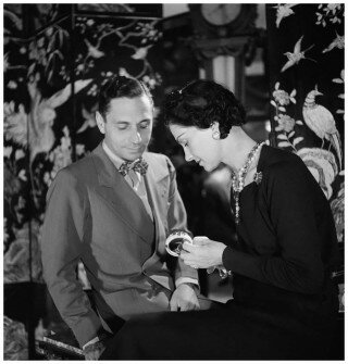
Fulco di Santostefano della Cerda, Duke of Verdura, was a man destined to be a legend. Born in Sicily in 1899, he moved to France in 1927. While in Paris, he met Coco Chanel and designed for her fashion house a line of jewelry in precious stones. He became Chanel’s favorite. In 1937, he was in New York and designed jewelry for Hollywood stars: Greta Garbo, Katherine Hepburn, Joan Crawford. Not until 1937, he opened his first boutique in New York. Ten years later, his European atelier in Paris. In those years he met Salvador Dali, who encouraged him to design a surreal collection. Fulco’s creations were normally based on nature motifs. In the 1950s he created a series of seashells encrusted with gems. Gloria Swanson, Barbara Hutton, Diana Vreeland, Jackie Kennedy, Princess Grace of Monaco and the Duchess of Windsor were just a few of his more famous clients. His designs often featured in Vogue and other magazines. Despite such fame, he rarely sought publicity. Di Verdura was an exceptional visual artist. He never married. He died in London in 1978. He was survived by his family and his legacy: the tradition of a unique artisan.


cosmetics-mixology-buly-1803-shop-paris-saint-germain
Enlarge

BULY 1803 – PARIS

Posted on October 2, 2014 by Editorial Staff

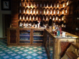
We are totally in love with Buly 1803 boutique. The rue Bonaparte emporium opened last April by husband-and-wife team Ramdane Touhami (the former co-owner of Cire Trudon) and Victoire de Taillac- Touhami (the former head of communications for Colette).

Awaken from the past you will enjoy wooden drawers and perfect packaged candles, essential oils, perfumes, soaps, all made in the tradition of nineteenth-century craftsmanship. A pretty old-looking apothecary officine, Bully was, in the past one of the inventors of modern cosmetics and perfumery. Nowadays the brand offers many product lines and over 400 total products.

 “For us, building on heritage and old beauty secrets was key: back in the days, products were free of paraben, phenoxyethanol and silicon, to name just a few. We even developed perfumes without alcohol or glycerine, which can dry and irritate the skin.”

http://buly1803.com/

Domingo Milella, Arsemia, Turkey, 2013
Enlarge

UNSEEN PHOTO FAIR AMSTERDAM

Posted on September 15, 2014 by Editorial Staff

Unseen Photo Fair first edition will opens its door from September 19 to 23 in Amsterdam’s Westergasfabriek, a former gasworks site dating back to 1885. Unseen will be a meeting place for young and established photographers and also a vitrine for 50 galleries from all over the world (check list here). The program also includes talks by photographers Lorenzo Vitturi, Daniel Gordon and Kate Steciw, a discussion on contemporary Japanese photography  and a panel discussion with the 2014 Foam Magazine Talents.

Full program and infos: http://unseenamsterdam.com/

Photo: Particular from Domingo Milella, Arsemia, Turkey, 2013 – Camilla Grimaldi Gallery London

EXIBITHION LOS ANGELES
Enlarge

HAUTE COUTURE: THE POLAROIDS OF CATHLEEN NAUNDORF

Posted on September 5, 2014 by Editorial Staff

Polaroids, once again, will never loose their allure. The Cathleen Naundorf exhibition at Fahey/Klein Gallery Los Angeles will opens its door on September 11th and it’s a must see for Polaroid fans. Instant shoots of haute couture as you never seen it before. Cathleen Naundrof started her career in the 90ies and traveled all over the world for prestigious publishing houses. In the beginning it was all about photo reportage on ethnic groups, then, after her encounter with Horst P.Horst, Naundorf became interested in fashion photography and that’s when the story started. Living in Paris and having access to Paris Fashion Week’s backstages, in years when nobody really was admitted, permitted this sensitive photographer to create an unique body of work now on view in Los Angeles. A must see.

Photo: Dior Haute-Couture, Summer 2007

http://www.faheykleingallery.com/


9-dior-1
Enlarge

FLORAL LEATHER? CUIR CANNAGE!

Posted on September 1, 2014 by Editorial Staff

Cuir Cannage is a diverse fragrance in which soft floral notes blend with the density of leather to open up a whole new realm. It recreates a world of intriguing scents that intertwines the fruity notes of a lipstick tinged with Rose and Violet along with more powerful scents, in which the leather of the bag meets the warmth of tobacco. Cuir Cannage appeals to the senses, like an olfactory portrait painted with personal and subtly scented objects, protected by the finest cannage-stitched leather. The Dior way.

Dior’s latest release, mixes flowers and leather in a masculine and feminine way. Let’s say it’s a Serge Lutense approach. Created by François Demarchy, the artistic director and nose for Parfums Dior, the name refers to the woven technique used on Dior’s “cannage” leather bags.  Orange blossoms are trailed by leather notes. Sweet, richly oiled aroma. The Dior scent has shifted the scales and the balance to make its leather more dominant. A black leather infused with a heavy dose of burnt tar, rubber, smoke. Delightful for all seasons. And remember: the Fall is the Spring of Winter!

www.dior.com

tumblr_mhgpa94i5s1qiqf01o1_500
Enlarge

BACK TO BLACK?

Posted on August 25, 2014 by Editorial Staff

Hop scotch to the desk, to the pc? To Times New Roman or Arial or Helvetica? Hop scotch to laced shoes-long-sleeved clothes? Hop scotch to whatever won’t deal with sand and sea? Hop scotch to set the alarm clock, dining table, food, grocery in the fridge? Hop scotch to the ordinary, to the scheduled?

No, dear ORDINARY. Oh No, dear COMMON. No No No dear COMMONPLACE, FREQUENT, ROUTINE, PLAIN, STANDARD, REGULAR EVERYDAY LIFE.

You won’t get us.

We are The Harlows and we are here to defeat you!

#endofsummerthoughts


TASCHEN 1998 BUMA 84
Enlarge

WALTON FORD

Posted on August 6, 2014 by Editorial Staff

American artist Walton Ford, makes paintings and prints like Audubon’s naturalist illustrations. His works are  meticulous studies in flora and fauna of great execution. Faithful to the natural history mode, Ford paints on a much larger scale, producing outsize watercolors with epic compositions.

Paul Kasmin Gallery of NYC is currently  hosting some of his magnificent watercolors. Surely a good thing to put on the TO DOs list!

tumblr_n8bfdqcWG41rtynt1o3_r1_500
Enlarge

DIARIES OF CEYLON

Posted on August 5, 2014 by Editorial Staff

An island country in the northern Indian Ocean, off the southeast coast of the Indian subcontinent in South Asia. Discover Ceylon, follow our diaries! From August the 11th a new column  on The Harlow!


JV FW14 Ringo Starr Single
Enlarge 0 Comment

PEACEROCKS

Posted on July 14, 2014 by Editorial Staff

On his 74th birthday, Ringo Starr becomes a model for the Fall 2014 advertising campaign of John Varvatos. This launch kicks off an initiative to support The Ringo Starr Peace & Love Fund. Starr, a pioneer of transcendental meditation who has been communicating the peace and love message for over 40 years, is fresh off the heels of accepting the 2014 Grammy Lifetime Achievement Award on behalf of The Beatles. #PEACEROCKS is a fully integrated program that raises awareness for the Ringo Starr Peace & Love Fund which helps implement scientifically proven stress-reducing modalities for at-risk populations suffering from epidemic levels of chronic stress and stress-related disorders that fuel violence, crime and soaring health costs. This call-to-action encourages participants to share photos of themselves flashing the peace sign via Instagram, Twitter, Vine, and Facebook, in an effort to raise funds while raising awareness. For each #PEACEROCKS tagged photo, $1 will be donated to the charity through the end of 2014.

more on: http://www.johnvarvatos.com/

BLEUCHANEL
Enlarge 0 Comment

BLEU CHANEL

Posted on July 9, 2014 by Editorial Staff

Launched in 2010, Bleu by Chanel is becoming one of my favorite fragrances. I do remember when I first smell it, I tough it was nothing special and I never ever smell it again until they gave me a sample last week. I have been using every single drop of that sample, every single day, and finally decided that  “Bleu” is definitely a good perfume, a new classic and I run to the counter. Bleu is just magic. I add it to the podium of my best perfumes list because it’s a quite, serene fragrance that never impress or cause shock. It’s sweet and masculine, never out of place. The sillage is absolutely in harmony with what I’m today and hope to be tomorrow. Also the blue bottle, banal in 2010, it’s now having a deep sense to me: it’s a pleasure to have it on my cabinet.  Jaques Polge, creator of Chanel’s perfumes since 1972 said:  ” Chanel doesn’t create fashion perfumes but epic perfumes that last” and what a better way to confirm this theory I had. They can be banal in the beginning, but once you fall in love, you are taken. Second chance sometimes it’s a better chance. 

Notes: Pink peppercorn, Citrus, Peppermint, Nutmeg, Vetiver, Grapefruit, Cedar, Labdanum, Jasmine, Incense, Patchouli, Ginger, Sandalwood


smashingpumpkins
Enlarge 0 Comment

PHOTORECORD NR. 7, MELLON COLLIE AND THE INFINITE SADNESS

Posted on July 4, 2014 by Editorial Staff

Released  on October 24, 1995 on Virgin Records, “Mellon Collie And The Infinite Sadness” is the third album by American alternative rock band The Smashing Pumpkins. In explaining what he wanted for this album cover Billy Corgan said : “ This is psychedelic music by a heavy metal band from the 1920s.” The illustrations, typography, and papers used for the artwork all reflect this 20’ies mood. Designed by Frank Olinsky’s Design Firm, art directed by  Billy Corgan and Olinsky himself, with illustrations  by John Carig and photos by Andrea Giacobbe, this is one of the best Album Covers we ever seen. It was just ahead, many years ahead. And last but not least, we adore typefaces used: Gill Sans, Glorietta and Le Petit Trottin were used. Mellon Collie And The Infinite Sadness, literally the spec of an entire generation.


FAGIOLO
Enlarge 0 Comment

THE FAGIOLO

Posted on July 3, 2014 by Editorial Staff

Symmertry and asimmetry in wooden structures have been at the centre of Roberto Lazzeroni’s design. His latest piece, the “fagiolo” which means “bean” in Italian, is a minimal, yet symmetrical structure, a table, available in different colors and finishes with a double-decker walnut solid frame and marble or glass tops.

www.ceccotticollezioni.it


61Z7M7H2SBL
Enlarge 0 Comment

PHOTO RECORD NR. 6, CULTURE CLUB

Posted on June 27, 2014 by Editorial Staff

The second album by the British new wave band Culture Club,Colours by Number was released in October 1983. Preceded by the hit single Karma Chameleon, it reached number one in several countries. In the UK it sold more than 10 million copies. Cover photo by photographer David Levine.  

emersoncooper man with spiral
Enlarge 0 Comment

EMERSON COOPER

Posted on June 24, 2014 by Editorial Staff

“Mending the Labyrinth” is and extensive body of work by artist Emerson Cooper for the first time as a solo show in New York. Emerson Cooper is a vintage photographs and Victorian cabinet cards collector. His work start from the transformation of these photos into meticulously constructed, psychologically charged artworks by using a mix of thread, paint, collage or digital manipulation. Used widely from the mid-19th century after the invention of albumen prints by Louis Désiré Blanquart-Evrard, the cabinet card remains a familiar visual object. Contemporaneous to the use of cabinet cards were the psychoanalytical theories of Freud and the high point of public interest in freak shows, and Cooper recalls these areas of interest simultaneously. Cooper’s images often allude to the sinister and plunge us headlong into the depths of identity and psyche, the real and the unreal, and the anguish of memory.

Until July 6th @ Muriel Guépin

Photo/ Man With Spiral, 2007-2010

http://www.murielguepingallery.com

Gelsomino
Enlarge 0 Comment

SCENT OF LOVE: GELSOMINO NOBILE

Posted on June 24, 2014 by Editorial Staff

Skin loves summer. Fact.

Summer makes us sing from rooftops, love from the deepest part of our hearts, play as if we were kids. Acqua di Parma Gelsomino Nobile is a special edition that comes with hand-engraved bottle decorated with 24ct gold. The scent is absolutely Nobile and it gives remembrances of Asia, nights of amusement, transporting memories. A tribute to the king of flowers, Calabrian jasmine, a noble ingredient used in classic perfumery, Gelsomino Nobile opens with the soft and sparkling notes of Italian mandarin and pink pepper. Creating a unique personality, the  blend closes with notes of cedar wood and musk. A fragrance that cracks the line, that simply stantsout!


maxwells-urban-hang-suite-4e7adc4b96468
Enlarge 0 Comment

PHOTORECORD NR. 5, MAXWELL

Posted on May 30, 2014 by Editorial Staff

One of the sexiest Albums ever produced. “Maxwell’s Urban Hang Suite” was the debut album of American singer Maxwell. Released on April 2 1996, Maxwell’s Urban Hang Suite was a tribute to the modernization of classical R&B and featured songs focused on adult romances from first encounter to its dramatic conclusion examining the concept of love, sex and spirituality. The album’s cover artwork features a picture of a pair of golden women’s shoes on the floor of a hotel room, with the bar coding prominently displayed. Maxwell didn’t want to appear on the cover and had to fight with record label for his ideas. “I wanted people to have the facts: the title, the selections and the fact that you had to basically buy it. I wanted people to come to the music and not base any opinion on the image”. Columbia Records reached a compromise and used a promotional shot of him as the back cover, taken by photographer Eric Johnson, while the beautiful photo of golden shoes remained uncredited.

Maya Angelou
Enlarge 0 Comment

PHENOMENAL WOMAN: MAYA ANGELOU

Posted on May 28, 2014 by Editorial Staff

Today a piece of The Harlow’s heart got broken. We lost Maya Angelou, poet, writer,singer, activist but most of all, PHENOMENAL WOMAN.

We do suggest reading her entire work, poems, biographies, stories.

Dear Maya, always and forever, and still, like air WE RISE!


berlinbiennale8logo
Enlarge 0 Comment

8th BERLIN BIENNALE

Posted on May 26, 2014 by Editorial Staff

The 8th Berlin Biennale brings together a range of international artistic positions that explore the intersection between larger historical narratives and individuals’ lives. The majority of the participating artists have produced new works for the exhibition, which proposes new perspectives on the facets of and relations in history. It spans four distinct venues in western Berlin and Berlin-Mitte—Haus am Waldsee, Museen Dahlem – Staatliche Museen zu Berlin, KW Institute for Contemporary Art, and Crash Pad c/o KW.The exhibition is on view from May 29 until August 3, 2014.

More: www.berlinbiennale.de

bjork-1993-jean-baptiste-mondino-debut-03
Enlarge 0 Comment

PHOTORECORD N.6, BJoRK

Posted on May 23, 2014 by Editorial Staff

Released in July 1993, Debut was the second studio album by Icelandic singer-songwriter Bjork. Recorded in the United Kingdom, Björk worked on the album with producer Nellee Hooper. The album mostly consisted of love songs relating to subjects such as her boyfriend Dominic Thrupp, her producer Nellee Hooper and to love of life itself. The Amazing cover photo was shot by photographer Jean Baptiste Mondino.


Janet-Jackson-Got-Til-Its-Gone1-1024x1024
Enlarge

PHOTO RECORD NR.5, JANET JACKSON

Posted on May 16, 2014 by Editorial Staff

Releasing date: 22 September 1997. “Got ‘Till It’s Gone” written by Janet Jackson, featuring Q-Tip and Joni Mitchell, was the anticipation single taken from Jackson’s sixth album, The Velvet Rope. Despite being a risk, it was a totally out of the mainstream sound, this song received very warm critics and a  very well deserved Grammy Award for “Best Short Form Music Video”. “Got ‘Till It’s Gone” reached number one in several countries and marked the return of Jackson to the scene after a period of struggle with depression and intimacy. Considered a  fusion of Jackson’s pop style with “harder-edged hip-hop” this song remains an excellent work and a must listen for new generations. The video for “Got ’til It’s Gone” was directed by Mark Romanek and filmed at the Hollywood Palladium in Los Angeles. Jackson portrays a lounge singer in the video, which takes place during the time of apartheid in South Africa. Inspired by a blend of ’60s and ’70s African culture and the work of photographer Malick Sidibé it won many prizes and certainly fashion oriented people’s heart. The cover of “Got ‘Till It’s Gone” was released during the filming and was shooted by rock-pop superstars photographer Eddie Wolfl. Joni Mitchell never lies.


carolekingcat
Enlarge

PHOTORECORD NR.4, CAROLE KING

Posted on May 9, 2014 by Editorial Staff

Tapestry by Carole King was released in 1971 and was one of the best-selling albums of all time, with over 25 million copies sold worldwide. The cover had been shot by photographer Jim McCray who was on the verge of shooting one of his most famous images when he stopped to ask singer Carole King if the cat sleeping across the room could be part of the tableau. He remembered the results of a Kodak survey that found “after children, the most popular thing people photographed was their own cats”. King assured him that her pet was docile, he carried the tabby and its pillow to the window ledge and into the frame. By the third click of his camera, the cat had slipped away but McCrary had what he needed: a picture of both the barefoot songstress and her whiskered feline that became the cover of King’s landmark.

07_-_1964_primo_vasetto_medium
Enlarge

HAPPY 50TH!

Posted on May 8, 2014 by Editorial Staff

It will happen on sunday May the 18th 2014, that marvelous spread Nutella will be 50 years old. Created in the 1940s by Mr. Pietro Ferrero,  pastry maker and founder of the Ferrero company, Nutella was at the very beginning called ‘Supercrema gianduja’. Since the very beginning the spread was well received and became so popular that Italian food stores started a service called “The Smearing”. Children could go to their local food store with a slice of bread for a “smear” of “supercrema gianduja.” In the 60’s, the name changed into NUT (hazelnut) and ELLA (a soft ending). Since European families and visitors have enjoyed Nutella as a breakfast staple on bread and toast for more than 40 years, the Ferrero Company wanted to introduce this traditional Italian breakfast item to the U.S. market in order to share the enjoyment of such a unique, convenient and tasty product.  Nutella was first imported from Italy to the U.S. For the 2014 anniversary, Ferrero has produced a limited edition of Nutella, with fluo glass jars. Ready for a smear?


VANESSA_PARADIS_VANESSA_PARADIS_FRONT
Enlarge

PHOTORECORD NR. 3

Posted on April 18, 2014 by Editorial Staff

The French wonder girl comes back with a new record after many years, and Joe Le Taxi, with a brand new look and a more International approach. In a relationship with Lenny Kratvitz, that produced this little pop gem, Vanessa is maturing and looking, more and more, as the brunette Brigitte Bardot. Remarkable songs : Sunday Mondays, The Future Song.

Title: Vanessa Paradis

Photo cover: Jean Baptiste Mondino

Relasing year: 1992

hyeres 2014
Enlarge

HYERèS 2014

Posted on April 17, 2014 by Editorial Staff

“Le Festival” de la mode y photographie par excellance. The 29th edition of Hyères International Festival will take place, as usual, in the delightful village of Cote D’Azur-Provence from 25th till 28th April. The jury has chosen ten young fashion designers, of eight different nationalities. Liselore Frowijn (Pays Bas, femme), Pablo Henrard (Belgique, Homme), Marit Ilison (Estonie, Femme), Anne Kluytenaar (Pays Bas, Homme), Coralie Marabelle (France, Femme), Kenta Matsushige (Japon, Femme), Agnese Narnicka (Lettonie, Homme), Louis-Gabriel Nouchi (France, Femme), Roshi Porkar (Autriche, Femme), Yulia Yefimtchuk (Ukraine, Femme) but also a selection of breathtaking photographers: Anna Grzelewska, Osma Harvilahti, Arnaud Lajeunia, Orianne Lopes, Birthe Piontek, Virginie Rebetez, Marie Rime, Marleen Sleeuwits, Charlotte Tanguy and Lorenzo Vitturi. A list of parallels events (concert and exibithion)  is listed on Hyères Festival Official Page. Better than anyone, the place to be to discover fashion and photography of tomorrow.

http://www.villanoailles-hyeres.com

WRAP_Gupta_Dining-Throne-Deconstructed1
Enlarge

GUNJAN GUPTA

Posted on April 15, 2014 by Editorial Staff

India’s heritage is tough to brush off, but Gunjan Gupta has taken it to advantage her work, and revisit forms, functions and concepts in furniture design. Delhi-based, she is an irreverent designer. Gupta’s brand has been, ever since the beginning, reviving traditional crafts, mostly from Rajasthan, giving a pepper difference. She has been around since 2006, being alumnus of the Central St. Martin College of Art and Design, London. Indian native crafts shift to contemporary utility keeping a luxury tag. An example? The deconstructed dining throne.

http://www.gunjangupta.in


253
Enlarge

DESIGN MIAMI / 2014

Posted on April 14, 2014 by Editorial Staff

It’s the global forum for design bringing together the most influential collectors, gallerists, designers, curators and critics from around the world. It celebrates design, culture and commerce. Occurring alongside the Art Basel fairs in Miami, and Basel,  Design Miami/ has become the premier venue for collecting, exhibiting, discussing and creating collectible design. Design Miami/ is more than a marketplace, it’s an exclusive commercial opportunity with progressive cultural programming. Ready for the new edition?

Design Miami/ Basel 2014

June 17-18/ 19-22/ 

the-smiths-hand-in-glove-rhino-700x698
Enlarge

PHOTORECORD NR. 2, THE SMITHS

Posted on April 11, 2014 by Editorial Staff

Hand in Glove. The very first single of The Smiths, 13 May 1983.

Great care was given by the Smiths for their album covers. A unique visual style, able to establish a consistent visual aesthetic. The Smiths covers were immediately identifiable. The band never appeared on their covers. Glamourous, erotic, iconographical, nostalgic and gender ambiguous. Images depicted cinema stars and pop culture in general. Morrissey chose all the covers, under the artistic direction of his personal assistant Jo Slee. ” The covers were an integral part of the group”- according to Geoff Travis (Rough Trade) – ” And Morrissey was the best to create them. We never made ​​suggestions to make it better.”

” The rest of the band had no involvement in the creation of the covers ,” said Johnny Marr “I was more than happy to go that way. Because every time I saw the artwork I’ve always been happy, impressed and surprised. What Morrissey did was to take all these influences that meant something to him, coming from very different places , and give them continuity . fans of The Smiths could identify immediately.

andreasgursky
Enlarge

EARLY LANDSCAPES, ANDREAS GURSKY

Posted on April 10, 2014 by Editorial Staff

Andreas Gursky. Master contemporary artist, born 1955 in Leipzig Germany. He lives and works in Dusseldorf and was appointed Professor of Liberal Arts at the Kunstakademie Dusseldorf in 2010. Gursky, from the very first years of his career, never stop making photographs of landscapes. It’s one of his recurring elements, a signature trait of this incredible artist. “Early Landscapes” it the first exhibition to focus on a group of important landscapes from the late 1980s to the early 1990s. Predating Gursky’s extensive use of digital technology, and characterized by what the artist has called an ‘extraterrestrial’ perspective, the pictures are titled simply and directly after the geographical location where they were taken. Gursky’s early landscapes provide the viewer with the concrete experience of a specific place as well as a “mental image”that has been passed down to us by the history of painting and inscribed into our collective memory.

Sprüth Magers London-  April 15th – june 21th  2014

OTSUKISAMA2
Enlarge

PORCELAIN BLUE, OTSUKI SAMA

Posted on April 9, 2014 by Editorial Staff

A Spring-Summer ready house needs some touches of blue, like the sea. The invigorating color is a must also for terraces and gardens. Blue is the coolest color. The color of the sky, ocean, sleep, twilight. The ancient Egyptians used lapis-lazuli to represent heaven. Blue symbolizes also the Virgin Mary and means inspiration, sincerity and spirituality. The Otsuki Sama blue is obtained with the Chinese technique of “wash drawing”, mixed with petals of Japanese Chrysanthemum and framed by the geometry of diamond in order to evoke motifs of the traditional porcelain tableware. Otsuki Sama, inspired by Japan and made in France, was founded by  designer, artist and master calligrapher Valérie Laudier: it’s a complete collection of elegant, yet contemporary, home furnishing, stationery and fashion accessories. Enchanting.

http://www.otsuki-sama.com/

bugaboo-andy-banana-pram-1
Enlarge

A BEAUTIFUL BUNCH, WE LIKE BANANAS!

Posted on April 8, 2014 by Editorial Staff

Feast your eyes on the Bugaboo Andy Warhol stroller, latest collaboration between the design and engineering Bugaboo and the artistic expression of pop art Andy Warhol. Warhol’s iconic banana (1966) will be part of your baby’s first ride. Warhol challenged the world of convention in order to see art differently. Bugaboo will celebrate pop art in its newest collection a rebellious and rockandroll attitude. Bugaboo Cameleon³ Banana combines the Warhol Banana print in black onto a striking and outspoken yellow base and a black chassis. The all-over print covers the sun canopy and continues on both the bassinet and backside of the seat fabric.  A versatile, functional and stylish stroller, a rocking disposition! In stores from May the 1st 2014. 

www.bugaboo.com

SUEDE____Suede_____1993_
Enlarge

PHOTORECORD NR. 1, SUEDE

Posted on April 4, 2014 by Editorial Staff

Introduction to Photorecord.

Every Friday The Harlow will make some space to historical-beautiful record covers that marked a phase of our lives. Record Covers are often real works of art but most of all, they encapsulate an epoch and revamp our memories even before listening the music they were created to help in selling. The importance of these images is doubtless and  fundamental in everybody’s life.

This week’s

Title: Suede 

Relasing year: 1993

Photo work is a gender-ambiguous cover art that provoked controversy.  The kissing couple was taken from the 1991 book Stolen Glances: Lesbians Take Photographs edited by Tessa Boffin and Jean Fraser. The photograph was taken by Tee Corinne and it shows a woman kissing an acquaintance in a wheelchair.

98
Enlarge

KUNDALINI E.T.A

Posted on April 2, 2014 by Editorial Staff

Kundalini E.T.A. by Guglielmo Berchicci is a sculptural lamp of refined artistic aesthetic. To us it is a classic icon of modern design, a beautiful and versatile decor object of minimal shape. The lamp is perfectly suited for living rooms, bedrooms and workspaces. Made in ecological fiberglass, it is characterized by the innovative use of materials and organic forms. It has also an handmade light diffuser of ecological fiberglass with a metallic inner structure which is removable for changing bulbs. It is available in white, orange, red, or silver. As suspension lamp, it has a wonderful polycarbonate reflector.

http://www.kundalini.it

BARBIERIFERRE'
Enlarge

THE GLAMOUR OF ITALIAN FASHION 1945-2014

Posted on April 2, 2014 by Editorial Staff

Dedicated to a small country and its post was miracle. Dedicated to our grandmothers and grandads that worked so hard to give their children’s a better future. Dedicated to Count Giorgini himself that believed in the potential of a new “fashion pole” and to that unexpected success. Dedicated to Americans, that, with their impeccable eyesight spotted a a country where quality and artisan skills where, and maybe still are, the best in the world.

“The Glamour of Italian Fashion”, an unmissable exhibition-celebration that opens up this Saturday at Victoria And Albert Museum.

Ph. GianPaolo Barbieri for Ferrè

http://www.vam.ac.uk/


yokoono-full
Enlarge

I LOVE YOU, ONO!

Posted on April 1, 2014 by Editorial Staff

From March 14–September 1, 2014 Guggenheim Bilbao will host 200 works of wide documentation on Yoko Ono. Divided in sections, installations, objects, drawings, photographs, text, the exhibition presents a comprehensive overview on the conceptual and the performing artist, two sides of a 4 decades career.  Ono’s  points of departure are oral or written guidelines for the audience, considered an active role in the art world. Yoko Ono, 80 years old this very year, emerged as a prominent figure of the New York avant-garde scene in the 70ies and became close to famous American icons. Not to mention, her works inspired by John Lennon. A must see.

http://www.guggenheim-bilbao.es/

THEBOX_flyer_front_WEB
Enlarge

THE BOX BY MERCATO MONTI

Posted on March 26, 2014 by Editorial Staff

Spring’s here and MercatoMonti’s team is ready to celebrate by offering a new shopping experience and a great party in honor of creativeness and handmade treasures.  After the success of last December’s edition  that welcomed 3000 visitors and involved more than 100 “creative minds”, it’s time for a brand new appointment. Sunday March 30th 2014 at The Radisson Blu Hotel, from 11 a.m. till 10 p.m., a new edition of The Box will be held.  Besides the usual shopping experience, the second appointment of “SUNDAY: I’M IN LOVE! – THE ARTIGENIAL GALLERY” will be hosted:  laboratory devoted to “art-ingeniousness” born by from the meeting of MercatoMonti with “Elsewhere Factory”. Visual artists, designer and artisans will symbolically reconstruct their own laboratory and will work during the whole day offering an unique occasion to observe the creative trial that characterizes their production. The “ALL GOOD” party is also confirmed: beginning from 6 pm, dance floor will be warmed and delighted by Playpen DcDJ SoulMind from “Disco Volante” Brescia  and Maxi Milian  DJ fron SoundsFamiliar Crew. Be ready for a special Sunday in Rome.

THE BOX – MERCATOMONTI

Sunday 30th  March 2014 –  from 11 a.m. till 10.00 p.m.  Free Entry
c/o Radisson Blu es. Hotel – Via Filippo Turati 171 – Roma  

www.mercatomonti.com